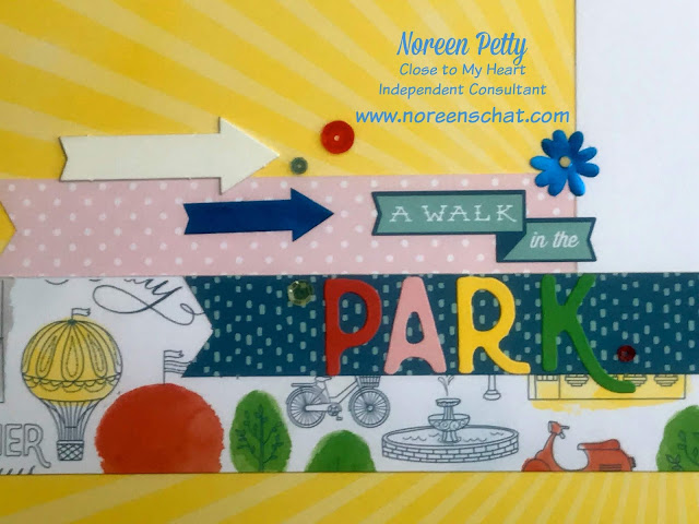
This
is the 3rd layout from the Central Park WYW Kit, literally the workshops layout
is pictured below. But the reverse of that blue patterned paper is a
vibrant sunshine paper that I felt was being wasted by using this blue side.
So here is what the layout was suppose to look like:
And here is me flipping the paper over to use that sunshine side that really appealed to me:
And here is me flipping the paper over to use that sunshine side that really appealed to me:
I
did have to adjust my title placement since the R in PARK would disappear on
the yellow paper, so I just moved it lower to the blue patterned paper.
Click here to view the Central Park Workshop Guide.
Click here to view the Central Park Workshop Guide.
Scrap ~ Chat ~ Create


No comments:
Post a Comment